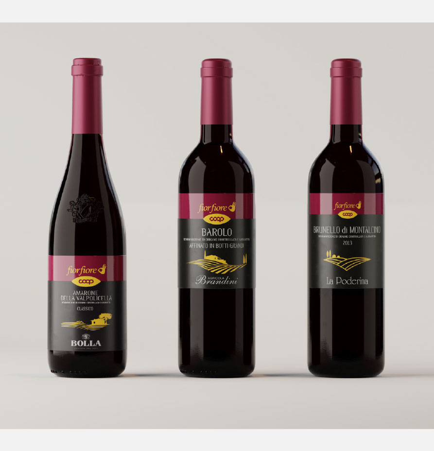
The design incorporates a harmonious color palette that reflects the brand’s image and the characteristics of the wine. Deep, rich colors like burgundy, deep reds, or luxurious golds are often used to convey a sense of premium quality and refinement.
The typography used in the graphic design plays a significant role in establishing the brand’s identity. It may feature a combination of classic serif fonts or modern, minimalist sans-serif fonts, depending on the desired aesthetic. The typography is carefully chosen to be legible and complement the overall design.
The brand’s logo is a focal point of the graphic design, serving as a distinctive mark that embodies the brand’s essence. It can feature unique typography, stylized elements, or a symbolic representation that captures the brand’s values and heritage.